
| 일 | 월 | 화 | 수 | 목 | 금 | 토 |
|---|---|---|---|---|---|---|
| 1 | 2 | 3 | 4 | 5 | ||
| 6 | 7 | 8 | 9 | 10 | 11 | 12 |
| 13 | 14 | 15 | 16 | 17 | 18 | 19 |
| 20 | 21 | 22 | 23 | 24 | 25 | 26 |
| 27 | 28 | 29 | 30 | 31 |
Tags
- 시험 일정
- separating data(데이터 분리하기)
- matplotlib
- numpy
- 응시료
- teen learn
- 준비
- 검정수수료
- 빅데이터 분석기사
- pythonML
- Seaborn
- List Comprehension
- context manger1
- K 데이터 자격시험
Archives
- Today
- Total
재원's 블로그
plotly.express에 있는 choropleth maps 이용해서 지도 그리기 본문
최초 작성일 : 2021-11-25
categories: Plotly
plotly.express 에 있는 'choropleth' 함수를 이용하면 지도를
그리는 것이 가능하다.
그리고 아래의 코드를 실행하기전 반드시
아래의 코드를 입력해 줘야지 에러가 발생하지 않는다.
import matplotlib.pyplot as plt
import plotly.express as px
import plotly.graph_objects as go
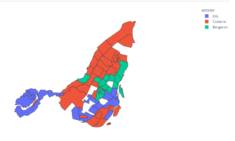
코드는 아래와 같다.
import plotly.express as px

df = px.data.election()
geojson = px.data.election_geojson()

fig = px.choropleth(df, geojson=geojson, color="winner",
                    locations="district", featureidkey="properties.district",
                    projection="mercator", hover_data=["Bergeron", "Coderre", "Joly"]
                   )
fig.update_geos(fitbounds="locations", visible=False)
fig.update_layout(margin={"r":0,"t":0,"l":0,"b":0})
fig.show()
참고로 위코드는 미국 선거 관련 데이터를 지도에 색상을 바꿔 시각화 한것이다.
'Plotly' 카테고리의 다른 글
| pyplot API+object oriented API (Pyplot API+객체지향 API) (0) | 2023.01.21 |
|---|