
| 일 | 월 | 화 | 수 | 목 | 금 | 토 |
|---|---|---|---|---|---|---|
| 1 | 2 | 3 | 4 | 5 | ||
| 6 | 7 | 8 | 9 | 10 | 11 | 12 |
| 13 | 14 | 15 | 16 | 17 | 18 | 19 |
| 20 | 21 | 22 | 23 | 24 | 25 | 26 |
| 27 | 28 | 29 | 30 | 31 |
- pythonML
- separating data(데이터 분리하기)
- 준비
- 검정수수료
- 빅데이터 분석기사
- List Comprehension
- Seaborn
- numpy
- context manger1
- teen learn
- K 데이터 자격시험
- 응시료
- 시험 일정
- matplotlib
- Today
- Total
재원's 블로그
matplotlib,seaborn 시각화 들어가기 본문
최초 작성일 : 2021-11-03
categories: Python
파이썬 데이터 시각화 들어가기 - matplotlib와 seaborn
import matplotlib.pyplot as plt #matplotlib.pyplot 모듈의 plt 함수를 사용한다는 뜻. dates = [ '2021-01-01', '2021-01-02', '2021-01-03', '2021-01-04', '2021-01-05', '2021-01-06', '2021-01-07', '2021-01-08', '2021-01-09', '2021-01-10' ] min_temperature = [20.7, 17.9, 18.8, 14.6, 15.8, 15.8, 15.8, 17.4, 21.8, 20.0] max_temperature = [34.7, 28.9, 31.8, 25.6, 28.8, 21.8, 22.8, 28.4, 30.8, 32.0] fig, ax = plt.subplots() #plt.subplot()는 add_subplot과 동일하게, 인수에 행의 수, 열의 수 및 몇 번째 등을 지정할 수 있다. #add_subplot과 다른 점은 현재의 이미지영역(fig=figure())에 추가하는 메소드라는 점이다. ax.plot(dates, min_temperature, label = "Min Temp") #plot은 하나의 그래프를 뜻 한다. ax.plot(dates, max_temperature, label = "Max Temp") #plot은 하나의 그래프를 뜻 한다. ax.legend() #ax.legend([라인1범례, 라인2범례]) 함수를 사용하여 각 라인에 대한 범례를 순서대로 지정할 수 있다. plt.show() #plt.show()를 사용하기 전까지는 제목이라든지 시각 요소들을 바꾸거나 설정할 수 있다. #현재의 컨텍스트가 flush()되는 구조인 듯 하다. 다시 차트를 생성하고 타이틀을 붙인 후에 렌더링할 수 있다. #matplotlib.pyplot 모듈의 show() 함수는 그래프를 화면에 나타나도록 합니다. 참고 블로그 : https://m.blog.naver.com/PostView.naver?isHttpsRedirect=true&blogId=heygun&logNo=221520454294
참고 블로그 :https://pinkwink.kr/976?category=522424

import matplotlib.pyplot as plt #matplotlib.pyplot 모듈의 plt 함수를 사용한다는 뜻. dates = [ '2021-01-01', '2021-01-02', '2021-01-03', '2021-01-04', '2021-01-05', '2021-01-06', '2021-01-07', '2021-01-08', '2021-01-09', '2021-01-10' ] min_temperature = [20.7, 17.9, 18.8, 14.6, 15.8, 15.8, 15.8, 17.4, 21.8, 20.0] max_temperature = [34.7, 28.9, 31.8, 25.6, 28.8, 21.8, 22.8, 28.4, 30.8, 32.0] fig, ax = plt.subplots() #plt.subplot()는 add_subplot과 동일하게, 인수에 행의 수, 열의 수 및 몇 번째 등을 지정할 수 있다. #add_subplot과 다른 점은 현재의 이미지영역(fig=figure())에 추가하는 메소드라는 점이다. ax.plot(dates, min_temperature, label = "Min Temp") #plot은 하나의 그래프를 뜻 한다. ax.plot(dates, max_temperature, label = "Max Temp") #plot은 하나의 그래프를 뜻 한다. ax.legend() #ax.legend([라인1범례, 라인2범례]) 함수를 사용하여 각 라인에 대한 범례를 순서대로 지정할 수 있다. plt.show() #matplotlib.pyplot 모듈의 show() 함수는 그래프를 화면에 나타나도록 합니다. 참고 블로그 : https://kongdols-room.tistory.com/87

import matplotlib.pyplot as plt #matplotlib.pyplot 모듈의 plt함수를 사용한다는 뜻. dates = [ '2021-01-01', '2021-01-02', '2021-01-03', '2021-01-04', '2021-01-05', '2021-01-06', '2021-01-07', '2021-01-08', '2021-01-09', '2021-01-10' ] min_temperature = [20.7, 17.9, 18.8, 14.6, 15.8, 15.8, 15.8, 17.4, 21.8, 20.0] max_temperature = [34.7, 28.9, 31.8, 25.6, 28.8, 21.8, 22.8, 28.4, 30.8, 32.0] fig, axes = plt.subplots(nrows=1, ncols=1, figsize=(10,6)) #plt.subplot()는 add_subplot과 동일하게, 인수에 행의 수, 열의 수 및 몇 번째 등을 지정할 수 있다. #add_subplot과 다른 점은 현재의 이미지영역(fig=figure())에 추가하는 메소드라는 점이다. axes.plot(dates, min_temperature, label = 'Min Temperature') #plot은 하나의 그래프를 뜻 한다. axes.plot(dates, max_temperature, label = 'Max Temperature') #plot은 하나의 그래프를 뜻 한다. axes.legend() #plt.legend([라인1범례, 라인2범례]) 함수를 사용하여 각 라인에 대한 범례를 순서대로 지정할 수 있다. plt.show() #matplotlib.pyplot 모듈의 show() 함수는 그래프를 화면에 나타나도록 합니다. 
print(fig) #figure 즉 그래프의 외형을 보여준다는 뜻. print(axes) # Figure(720x432) AxesSubplot(0.125,0.125;0.775x0.755) Matplotlib
선 그래프
방법 1. Pyplot API
- 코드 변경됨..
- 참조: https://pypi.org/project/fix-yahoo-finance/
!pip install yfinance --upgrade --no-cache-dir Collecting yfinance Downloading yfinance-0.1.64.tar.gz (26 kB) Requirement already satisfied: pandas>=0.24 in /usr/local/lib/python3.7/dist-packages (from yfinance) (1.1.5) Requirement already satisfied: numpy>=1.15 in /usr/local/lib/python3.7/dist-packages (from yfinance) (1.19.5) Requirement already satisfied: requests>=2.20 in /usr/local/lib/python3.7/dist-packages (from yfinance) (2.23.0) Requirement already satisfied: multitasking>=0.0.7 in /usr/local/lib/python3.7/dist-packages (from yfinance) (0.0.9) Collecting lxml>=4.5.1 Downloading lxml-4.6.4-cp37-cp37m-manylinux_2_17_x86_64.manylinux2014_x86_64.manylinux_2_24_x86_64.whl (6.3 MB) [K |████████████████████████████████| 6.3 MB 6.2 MB/s [?25hRequirement already satisfied: python-dateutil>=2.7.3 in /usr/local/lib/python3.7/dist-packages (from pandas>=0.24->yfinance) (2.8.2) Requirement already satisfied: pytz>=2017.2 in /usr/local/lib/python3.7/dist-packages (from pandas>=0.24->yfinance) (2018.9) Requirement already satisfied: six>=1.5 in /usr/local/lib/python3.7/dist-packages (from python-dateutil>=2.7.3->pandas>=0.24->yfinance) (1.15.0) Requirement already satisfied: urllib3!=1.25.0,!=1.25.1,<1.26,>=1.21.1 in /usr/local/lib/python3.7/dist-packages (from requests>=2.20->yfinance) (1.24.3) Requirement already satisfied: certifi>=2017.4.17 in /usr/local/lib/python3.7/dist-packages (from requests>=2.20->yfinance) (2021.5.30) Requirement already satisfied: chardet<4,>=3.0.2 in /usr/local/lib/python3.7/dist-packages (from requests>=2.20->yfinance) (3.0.4) Requirement already satisfied: idna<3,>=2.5 in /usr/local/lib/python3.7/dist-packages (from requests>=2.20->yfinance) (2.10) Building wheels for collected packages: yfinance Building wheel for yfinance (setup.py) ... [?25l[?25hdone Created wheel for yfinance: filename=yfinance-0.1.64-py2.py3-none-any.whl size=24109 sha256=cb13c3c13a2ccf2a7bf18fbe70a4ea79f748d595de3adc1f7d8a4d0122c5b0cd Stored in directory: /tmp/pip-ephem-wheel-cache-cm84kw_9/wheels/86/fe/9b/a4d3d78796b699e37065e5b6c27b75cff448ddb8b24943c288 Successfully built yfinance Installing collected packages: lxml, yfinance Attempting uninstall: lxml Found existing installation: lxml 4.2.6 Uninstalling lxml-4.2.6: Successfully uninstalled lxml-4.2.6 Successfully installed lxml-4.6.4 yfinance-0.1.64 import yfinance as yf data = yf.download('AAPL', '2019-08-01', '2020-08-01') data.info() #info() 컬럼 이름, 결측를 제외한 값 카운트, 타입을 보여줍니다. [*********************100%***********************] 1 of 1 completed <class 'pandas.core.frame.DataFrame'> DatetimeIndex: 253 entries, 2019-08-01 to 2020-07-31 Data columns (total 6 columns): # Column Non-Null Count Dtype --- ------ -------------- ----- 0 Open 253 non-null float64 1 High 253 non-null float64 2 Low 253 non-null float64 3 Close 253 non-null float64 4 Adj Close 253 non-null float64 5 Volume 253 non-null int64 dtypes: float64(5), int64(1) memory usage: 13.8 KB 참고 블로그: https://nomalcy.tistory.com/33?category=937860
ts = data['Open'] print(ts.head()) Date 2019-08-01 53.474998 2019-08-02 51.382500 2019-08-05 49.497501 2019-08-06 49.077499 2019-08-07 48.852501 Name: Open, dtype: float64 # import fix_yahoo_finance as yf import yfinance as yf import matplotlib.pyplot as plt #matplotlib.pyplot 모듈의 plt 함수를 사용한다는 뜻. data = yf.download('AAPL', '2019-08-01', '2020-08-01') ts = data['Open'] plt.figure(figsize=(10,6)) #figure는 그래프의 외형을 뜻한다. plt.plot(ts) #plot은 하나의 그래프를 뜻 한다. plt.legend(labels=['Price'], loc='best') #ax.legend([라인1범례, 라인2범례]) 함수를 사용하여 각 라인에 대한 범례를 순서대로 지정할 수 있다. plt.title('Stock Market fluctuation of AAPL') #title 제목을 설정할 수 있다. plt.xlabel('Date') #xlabel x축에 들어갈 이름을 설정할 수 있다. plt.ylabel('Stock Market Open Price') #ylabel y축에 들어갈 이름을 설정할 수 있다. plt.show() #matplotlib.pyplot 모듈의 show() 함수는 그래프를 화면에 나타나도록 합니다. [*********************100%***********************] 1 of 1 completed 
방법 2. 객체지향 API
from matplotlib.backends.backend_agg import FigureCanvasAgg as FigureCanvas from matplotlib.figure import Figure import matplotlib.pyplot as plt #matplotlib.pyplot 모듈의 plt 함수를 사용한다는 뜻. fig = Figure() import numpy as np np.random.seed(6) x = np.random.randn(20000) ax = fig.add_subplot(111) #plt.subplot()는 add_subplot과 동일하게, 인수에 행의 수, 열의 수 및 몇 번째 등을 지정할 수 있다. #add_subplot과 다른 점은 현재의 이미지영역(fig=figure())에 추가하는 메소드라는 점이다. ax.hist(x, 100) #Axes 객체는 실제 이미지 데이터의 역할을 한다. ax.set_title('Artist Layer Histogram') #set_title 제목을 설정할 수 있다. # fig.savefig('Matplotlib_histogram.png') plt.show() #matplotlib.pyplot 모듈의 show() 함수는 그래프를 화면에 나타나도록 합니다. 방법 3. Pyplot API + 객체지향 API
import yfinance as yf # yfinance 모듈의 yf 함수를 가져과 사용하겠다는 뜻. 참고 블로그 : https://junyoru.tistory.com/144 import matplotlib.pyplot as plt #matplotlib.pyplot 모듈에 plt함수를 가져와 사용하겠다는 뜻. data = yf.download('AAPL', '2019-08-01', '2020-08-01') 참고 블로그 : https://junyoru.tistory.com/144 ts = data['Open'] fig, ax = plt.subplots(figsize=(10, 6)) #plt.subplot()는 add_subplot과 동일하게, 인수에 행의 수, 열의 수 및 몇 번째 등을 지정할 수 있다. #add_subplot과 다른 점은 현재의 이미지영역(fig=figure())에 추가하는 메소드라는 점이다. ax.plot(ts) #plot은 하나의 그래프를 뜻 한다. ax.set_title('Stock Market fluctuation of AAPL') #set_title 제목을 설정 할 수 있다. ax.legend(labels=['Price'], loc='best') #ax.legend([라인1범례, 라인2범례]) 함수를 사용하여 각 라인에 대한 범례를 순서대로 지정할 수 있다. ax.set_xlabel('Date') #xlabel x축에 들어갈 이름을 설정할 수 있다. ax.set_ylabel('Stock Market Open Price') #ylabel y축에 들어갈 이름을 설정할 수 있다. plt.show() #plt.show()를 사용하기 전까지는 제목이라든지 시각 요소들을 바꾸거나 설정할 수 있다. #현재의 컨텍스트가 flush()되는 구조인 듯 하다. 다시 차트를 생성하고 타이틀을 붙인 후에 렌더링할 수 있다. #matplotlib.pyplot 모듈의 show() 함수는 그래프를 화면에 나타나도록 합니다. [*********************100%***********************] 1 of 1 completed 
# import fix_yahoo_finance as yf import yfinance as yf import matplotlib.pyplot as plt #matplotlib.pyplot 모듈의 plt 함수를 사용한다는 뜻. data = yf.download('AAPL', '2019-08-01', '2020-08-01') 참고 블로그 : https://junyoru.tistory.com/144 ts = data['Open'] fig, ax = plt.subplots(figsize=(10, 6)) # 직접 Figure 객체 생성 # ax= fig.subplots() #plt.subplot()는 add_subplot과 동일하게, 인수에 행의 수, 열의 수 및 몇 번째 등을 지정할 수 있다. #add_subplot과 다른 점은 현재의 이미지영역(fig=figure())에 추가하는 메소드라는 점이다. ax.plot(ts) # 생성된 axes 에 대한 plot() 멤버 직접 호출 ax.set_title('Stock Market fluctuation of AAPL') #set_title 제목을 설정 할 수 있다. ax.legend(labels=['Price'], loc='best') #ax.legend([라인1범례, 라인2범례]) 함수를 사용하여 각 라인에 대한 범례를 순서대로 지정할 수 있다. ax.set_xlabel('Date') #set_xlabel x축에 들어갈 이름을 설정할 수 있다. ax.set_ylabel('Stock Market Open Price') #set_ylabel y축에 들어갈 이름을 설정할 수 있다. plt.show() #matplotlib.pyplot 모듈의 show() 함수는 그래프를 화면에 나타나도록 합니다. [*********************100%***********************] 1 of 1 completed 
막대 그래프
import matplotlib.pyplot as plt #matplotlib.pyplot 모듈의 plt 함수를 사용한다는 뜻. import numpy as np import calendar month_list = [1, 2, 3, 4, 5, 6, 7, 8, 9, 10, 11, 12] sold_list = [300, 400, 550, 900, 600, 960, 900, 910, 800, 700, 550, 450] fig, ax = plt.subplots(figsize=(10,6)) #plt.subplot()는 add_subplot과 동일하게, 인수에 행의 수, 열의 수 및 몇 번째 등을 지정할 수 있다. #add_subplot과 다른 점은 현재의 이미지영역(fig=figure())에 추가하는 메소드라는 점이다. plt.xticks(month_list, calendar.month_name[1:13], rotation=90) plot = ax.bar(month_list, sold_list) #plot은 하나의 그래프이고 bar함수를 사용해서 막대그래프를 그린다는 의미. for rect in plot: print("graph:", rect) height = rect.get_height() ax.text(rect.get_x() + rect.get_width()/2., 1.002*height, '%d' % int(height), ha='center', va='bottom') plt.show() #matplotlib.pyplot 모듈의 show() 함수는 그래프를 화면에 나타나도록 합니다. 
graph: Rectangle(xy=(0.6, 0), width=0.8, height=300, angle=0) graph: Rectangle(xy=(1.6, 0), width=0.8, height=400, angle=0) graph: Rectangle(xy=(2.6, 0), width=0.8, height=550, angle=0) graph: Rectangle(xy=(3.6, 0), width=0.8, height=900, angle=0) graph: Rectangle(xy=(4.6, 0), width=0.8, height=600, angle=0) graph: Rectangle(xy=(5.6, 0), width=0.8, height=960, angle=0) graph: Rectangle(xy=(6.6, 0), width=0.8, height=900, angle=0) graph: Rectangle(xy=(7.6, 0), width=0.8, height=910, angle=0) graph: Rectangle(xy=(8.6, 0), width=0.8, height=800, angle=0) graph: Rectangle(xy=(9.6, 0), width=0.8, height=700, angle=0) graph: Rectangle(xy=(10.6, 0), width=0.8, height=550, angle=0) graph: Rectangle(xy=(11.6, 0), width=0.8, height=450, angle=0) import matplotlib.pyplot as plt #matplotlib.pyplot 모듈의 plt 함수를 사용한다는 뜻. import numpy as np import calendar month_list = [1, 2, 3, 4, 5, 6, 7, 8, 9, 10, 11, 12] sold_list = [300, 400, 550, 900, 600, 960, 900, 910, 800, 700, 550, 450] fig, ax = plt.subplots(figsize=(10,6)) #plt.subplot()는 add_subplot과 동일하게, 인수에 행의 수, 열의 수 및 몇 번째 등을 지정할 수 있다. #add_subplot과 다른 점은 현재의 이미지영역(fig=figure())에 추가하는 메소드라는 점이다. plt.xticks(month_list, calendar.month_name[1:13], rotation=90) plot = ax.bar(month_list, sold_list) for rect in plot: print("graph:", rect) height = rect.get_height() ax.text(rect.get_x() + rect.get_width()/2., 1.002*height,'%d' % int(height), ha='center', va='bottom') plt.show() #matplotlib.pyplot 모듈의 show() 함수는 그래프를 화면에 나타나도록 합니다. graph: Rectangle(xy=(0.6, 0), width=0.8, height=300, angle=0) graph: Rectangle(xy=(1.6, 0), width=0.8, height=400, angle=0) graph: Rectangle(xy=(2.6, 0), width=0.8, height=550, angle=0) graph: Rectangle(xy=(3.6, 0), width=0.8, height=900, angle=0) graph: Rectangle(xy=(4.6, 0), width=0.8, height=600, angle=0) graph: Rectangle(xy=(5.6, 0), width=0.8, height=960, angle=0) graph: Rectangle(xy=(6.6, 0), width=0.8, height=900, angle=0) graph: Rectangle(xy=(7.6, 0), width=0.8, height=910, angle=0) graph: Rectangle(xy=(8.6, 0), width=0.8, height=800, angle=0) graph: Rectangle(xy=(9.6, 0), width=0.8, height=700, angle=0) graph: Rectangle(xy=(10.6, 0), width=0.8, height=550, angle=0) graph: Rectangle(xy=(11.6, 0), width=0.8, height=450, angle=0) -참고 블로그 : https://zephyrus1111.tistory.com/9

산점도 그래프
- 두개의 연속형 변수 (키, 몸무게 등)
- 상관관계 != 인과관계
import matplotlib.pyplot as plt #matplotlib.pyplot 모듈의 plt 함수를 사용한다는 뜻. import seaborn as sns # 내장 데이터 tips = sns.load_dataset("tips") x = tips['total_bill'] y = tips['tip'] fig, ax = plt.subplots(figsize=(10, 6)) #plt.subplot()는 add_subplot과 동일하게, 인수에 행의 수, 열의 수 및 몇 번째 등을 지정할 수 있다. #add_subplot과 다른 점은 현재의 이미지영역(fig=figure())에 추가하는 메소드라는 점이다. ax.scatter(x, y) ax.set_xlabel('Total Bill') #set_xlabel x축에 들어갈 이름을 설정할 수 있다. ax.set_ylabel('Tip') #set_ylabel y축에 들어갈 이름을 설정할 수 있다. ax.set_title('Tip ~ Total Bill') #set_title 제목을 설정 할 수 있다. fig.show() #matplotlib.pyplot 모듈의 show() 함수는 그래프를 화면에 나타나도록 합니다. 
label, data = tips.groupby('sex') tips['sex_color'] = tips['sex'].map({"Female" : "#0000FF", "Male" : "#00FF00"}) fig, ax = plt.subplots(figsize=(10, 6)) #plt.subplot()는 add_subplot과 동일하게, 인수에 행의 수, 열의 수 및 몇 번째 등을 지정할 수 있다. #add_subplot과 다른 점은 현재의 이미지영역(fig=figure())에 추가하는 메소드라는 점이다. for label, data in tips.groupby('sex'): ax.scatter(data['total_bill'], data['tip'], label=label, color=data['sex_color'], alpha=0.5) ax.set_xlabel('Total Bill') #set_xlabel x축에 들어갈 이름을 설정할 수 있다. ax.set_ylabel('Tip') #set_ylabel y축에 들어갈 이름을 설정할 수 있다. ax.set_title('Tip ~ Total Bill by Gender') #set_title 제목을 설정 할 수 있다. ax.legend() fig.show() #matplotlib.pyplot 모듈의 show() 함수는 그래프를 화면에 나타나도록 합니다. 
참고 블로그 : https://yganalyst.github.io/etc/visual_1/
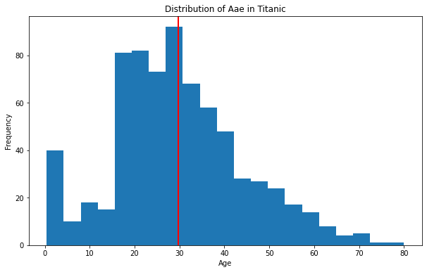
히스토그램
- 수치형 변수 1개
- ```python
import matplotlib.pyplot as plt #matplotlib.pyplot 모듈의 plt 함수를 사용한다는 뜻.
import numpy as np
import seaborn as sns
내장 데이터
titanic = sns.load_dataset('titanic') #sns 라이브러리에서 기본적으로 제공하는 titanic 데이터셋
age = titanic['age']
nbins = 21
fig, ax = plt.subplots(figsize=(10, 6))
#plt.subplot()는 add_subplot과 동일하게, 인수에 행의 수, 열의 수 및 몇 번째 등을 지정할 수 있다.
#add_subplot과 다른 점은 현재의 이미지영역(fig=figure())에 추가하는 메소드라는 점이다.
ax.hist(age, bins = nbins)
ax.set_xlabel("Age") #set_xlabel x축에 들어갈 이름을 설정할 수 있다.
ax.set_ylabel("Frequency") #set_ylabel y축에 들어갈 이름을 설정할 수 있다.
ax.set_title("Distribution of Aae in Titanic") #set_title 제목을 설정 할 수 있다.
ax.axvline(x = age.mean(), linewidth = 2, color = 'r')
fig.show() #matplotlib.pyplot 모듈의 show() 함수는 그래프를 화면에 나타나도록 합니다.
 참고 블로그 : https://hleecaster.com/python-matplotlib-histogram/ ### 박스플롯 - x축 변수: 범주형 변수, 그룹과 관련있는 변수, 문자열 - y축 변수: 수치형 변수 ```python import matplotlib.pyplot as plt #matplotlib.pyplot 모듈의 plt 함수를 사용한다는 뜻. import seaborn as sns iris = sns.load_dataset('iris') #sns 라이브러리에서 기본적으로 제공하는 iris 데이터셋 data = [iris[iris['species']=="setosa"]['petal_width'], iris[iris['species']=="versicolor"]['petal_width'], iris[iris['species']=="virginica"]['petal_width']] fig, ax = plt.subplots(figsize=(10, 6)) #plt.subplot()는 add_subplot과 동일하게, 인수에 행의 수, 열의 수 및 몇 번째 등을 지정할 수 있다. #add_subplot과 다른 점은 현재의 이미지영역(fig=figure())에 추가하는 메소드라는 점이다. ax.boxplot(data, labels=['setosa', 'versicolor', 'virginica']) fig.show() #matplotlib.pyplot 모듈의 show() 함수는 그래프를 화면에 나타나도록 합니다. 
참고 홈페이지 : https://matplotlib.org/stable/api/_as_gen/matplotlib.pyplot.boxplot.html
https://flyingkiwi.tistory.com/18
히트맵
import matplotlib.pyplot as plt #matplotlib.pyplot 모듈의 plt 함수를 사용한다는 뜻. import numpy as np import seaborn as sns # 내장 데이터 flights = sns.load_dataset("flights") #sns 라이브러리에서 기본적으로 제공하는 flights 데이터셋. flights = flights.pivot("month", "year", "passengers") fig, ax = plt.subplots(figsize=(12, 6)) #plt.subplot()는 add_subplot과 동일하게, 인수에 행의 수, 열의 수 및 몇 번째 등을 지정할 수 있다. #add_subplot과 다른 점은 현재의 이미지영역(fig=figure())에 추가하는 메소드라는 점이다. im = ax.imshow(flights, cmap = 'YlGnBu') ax.set_xticklabels(flights.columns, rotation = 20) ax.set_yticklabels(flights.index, rotation = 10) fig.colorbar(im) fig.show() #matplotlib.pyplot 모듈의 show() 함수는 그래프를 화면에 나타나도록 합니다. year month passengers 0 1949 Jan 112 1 1949 Feb 118 2 1949 Mar 132 3 1949 Apr 129 4 1949 May 121 .. ... ... ... 139 1960 Aug 606 140 1960 Sep 508 141 1960 Oct 461 142 1960 Nov 390 143 1960 Dec 432 [144 rows x 3 columns] 
참고 블로그 : https://rfriend.tistory.com/419
Seaborn
산점도과 회귀선이 있는 산점도
%matplotlib inline import matplotlib.pyplot as plt #matplotlib.pyplot 모듈의 plt 함수를 사용한다는 뜻. import seaborn as sns tips = sns.load_dataset("tips") #sns 라이브러리에서 기본적으로 제공하는 tips 데이터셋 print(tips) sns.scatterplot(x = "total_bill", y = "tip", data = tips) plt.show() #matplotlib.pyplot 모듈의 show() 함수는 그래프를 화면에 나타나도록 합니다. total_bill tip sex smoker day time size 0 16.99 1.01 Female No Sun Dinner 2 1 10.34 1.66 Male No Sun Dinner 3 2 21.01 3.50 Male No Sun Dinner 3 3 23.68 3.31 Male No Sun Dinner 2 4 24.59 3.61 Female No Sun Dinner 4 .. ... ... ... ... ... ... ... 239 29.03 5.92 Male No Sat Dinner 3 240 27.18 2.00 Female Yes Sat Dinner 2 241 22.67 2.00 Male Yes Sat Dinner 2 242 17.82 1.75 Male No Sat Dinner 2 243 18.78 3.00 Female No Thur Dinner 2 [244 rows x 7 columns] 
참고 블로그 : https://blog.naver.com/breezehome50/222312834309
fig, ax = plt.subplots(nrows = 1, ncols = 2, figsize=(15, 5)) #plt.subplot()는 add_subplot과 동일하게, 인수에 행의 수, 열의 수 및 몇 번째 등을 지정할 수 있다. #add_subplot과 다른 점은 현재의 이미지영역(fig=figure())에 추가하는 메소드라는 점이다. sns.regplot(x = "total_bill", y = "tip", data = tips, ax = ax[0], fit_reg = True) sns.regplot(x = "total_bill", y = "tip", data = tips, ax = ax[1], fit_reg = False) plt.show() #matplotlib.pyplot 모듈의 show() 함수는 그래프를 화면에 나타나도록 합니다. 
히스토그램/커널 밀도 그래프
import matplotlib.pyplot as plt #matplotlib.pyplot 모듈의 plt 함수를 사용한다는 뜻. import seaborn as sns tips = sns.load_dataset("tips") #sns 라이브러리에서 기본적으로 제공하는 tips 데이터셋 sns.displot(x = "tip", data = tips) plt.figure(figsize=(10, 6)) #matplotlib은 한 번에 한장의 그림을 그린다. 이 그림을 가리키는 용어가 figure이다. plt.show() #matplotlib.pyplot 모듈의 show() 함수는 그래프를 화면에 나타나도록 합니다. 
<Figure size 720x432 with 0 Axes>
sns.displot(x="tip", kind="kde", data=tips) plt.show() #matplotlib.pyplot 모듈의 show() 함수는 그래프를 화면에 나타나도록 합니다. 
sns.displot(x="tip", kde=True, data=tips) plt.show() #matplotlib.pyplot 모듈의 show() 함수는 그래프를 화면에 나타나도록 합니다. 
박스플롯
sns.boxplot(x = "day", y = "total_bill", data = tips) sns.swarmplot(x = "day", y = "total_bill", data = tips, alpha = .25) plt.show() #matplotlib.pyplot 모듈의 show() 함수는 그래프를 화면에 나타나도록 합니다. 
참고 블로그 : https://hleecaster.com/python-seaborn-kdeplot/
https://darkpgmr.tistory.com/147
막대 그래프
sns.countplot(x = "day", data = tips) plt.show() #matplotlib.pyplot 모듈의 show() 함수는 그래프를 화면에 나타나도록 합니다. 
print(tips['day'].value_counts()) print("index: ", tips['day'].value_counts().index) print("values: ", tips['day'].value_counts().values) Sat 87 Sun 76 Thur 62 Fri 19 Name: day, dtype: int64 index: CategoricalIndex(['Sat', 'Sun', 'Thur', 'Fri'], categories=['Thur', 'Fri', 'Sat', 'Sun'], ordered=False, dtype='category') values: [87 76 62 19] print(tips['day'].value_counts(ascending=True)) Fri 19 Thur 62 Sun 76 Sat 87 Name: day, dtype: int64 plt.show() #matplotlib.pyplot 모듈의 show() 함수는 그래프를 화면에 나타나도록 합니다. ax = sns.countplot(x = "day", data = tips, order = tips['day'].value_counts().index) for p in ax.patches: # 조건문-반복for문이다. height = p.get_height() ax.text(p.get_x() + p.get_width()/2., height+3, height, ha = 'center', size=9) ax.set_ylim(-5, 100) plt.show() #matplotlib.pyplot 모듈의 show() 함수는 그래프를 화면에 나타나도록 합니다. 
ax = sns.countplot(x = "day", data = tips, hue = "sex", dodge = True, order = tips['day'].value_counts().index) for p in ax.patches: # 조건문-반복for문이다. height = p.get_height() ax.text(p.get_x() + p.get_width()/2., height+3, height, ha = 'center', size=9) ax.set_ylim(-5, 100) plt.show() #matplotlib.pyplot 모듈의 show() 함수는 그래프를 화면에 나타나도록 합니다. 
상관관계 그래프
import pandas as pd import numpy as np #matplotlib에 numpy모듈에서 numpy함수를 사용하겠다는 의미. import seaborn as sns #seaborn에 있는 sns함수를 사용하겠다는 의미. import matplotlib.pyplot as plt mpg = sns.load_dataset("mpg") print(mpg.shape) # 398 행, 9개 열 num_mpg = mpg.select_dtypes(include = np.number) print(num_mpg.shape) # 398 행, 7개 열 (398, 9) (398, 7) num_mpg.info() <class 'pandas.core.frame.DataFrame'> RangeIndex: 398 entries, 0 to 397 Data columns (total 7 columns): # Column Non-Null Count Dtype --- ------ -------------- ----- 0 mpg 398 non-null float64 1 cylinders 398 non-null int64 2 displacement 398 non-null float64 3 horsepower 392 non-null float64 4 weight 398 non-null int64 5 acceleration 398 non-null float64 6 model_year 398 non-null int64 dtypes: float64(4), int64(3) memory usage: 21.9 KB num_mpg.corr() | mpg | cylinders | displacement | horsepower | weight | acceleration | model_year | |
|---|---|---|---|---|---|---|---|
| mpg | 1.000000 | -0.775396 | -0.804203 | -0.778427 | -0.831741 | 0.420289 | 0.579267 |
| cylinders | -0.775396 | 1.000000 | 0.950721 | 0.842983 | 0.896017 | -0.505419 | -0.348746 |
| displacement | -0.804203 | 0.950721 | 1.000000 | 0.897257 | 0.932824 | -0.543684 | -0.370164 |
| horsepower | -0.778427 | 0.842983 | 0.897257 | 1.000000 | 0.864538 | -0.689196 | -0.416361 |
| weight | -0.831741 | 0.896017 | 0.932824 | 0.864538 | 1.000000 | -0.417457 | -0.306564 |
| acceleration | 0.420289 | -0.505419 | -0.543684 | -0.689196 | -0.417457 | 1.000000 | 0.288137 |
| model_year | 0.579267 | -0.348746 | -0.370164 | -0.416361 | -0.306564 | 0.288137 | 1.000000 |
fig, ax = plt.subplots(nrows = 1, ncols = 2, figsize=(16, 5)) #plt.subplot()는 add_subplot과 동일하게, 인수에 행의 수, 열의 수 및 몇 번째 등을 지정할 수 있다. #add_subplot과 다른 점은 현재의 이미지영역(fig=figure())에 추가하는 메소드라는 점이다. # 기본 그래프 [Basic Correlation Heatmap] sns.heatmap(num_mpg.corr(), ax=ax[0]) ax[0].set_title('Basic Correlation Heatmap', pad = 12) #set_title 제목을 설정 할 수 있다. # 상관관계 수치 그래프 [Correlation Heatmap with Number] sns.heatmap(num_mpg.corr(), vmin=-1, vmax=1, annot=True, ax=ax[1]) ax[1].set_title('Correlation Heatmap with Number', pad = 12) #set_title 제목을 설정할 수 있다. plt.show() #matplotlib.pyplot 모듈의 show() 함수는 그래프를 화면에 나타나도록 합니다. 
print(int(True)) np.triu(np.ones_like(num_mpg.corr())) 1 array([[1., 1., 1., 1., 1., 1., 1.], [0., 1., 1., 1., 1., 1., 1.], [0., 0., 1., 1., 1., 1., 1.], [0., 0., 0., 1., 1., 1., 1.], [0., 0., 0., 0., 1., 1., 1.], [0., 0., 0., 0., 0., 1., 1.], [0., 0., 0., 0., 0., 0., 1.]]) mask = np.triu(np.ones_like(num_mpg.corr(), dtype=np.bool)) print(mask) [[ True True True True True True True] [False True True True True True True] [False False True True True True True] [False False False True True True True] [False False False False True True True] [False False False False False True True] [False False False False False False True]] fig, ax = plt.subplots(figsize=(16, 5) #plt.subplot()는 add_subplot과 동일하게, 인수에 행의 수, 열의 수 및 몇 번째 등을 지정할 수 있다. #add_subplot과 다른 점은 현재의 이미지영역(fig=figure())에 추가하는 메소드라는 점이다. # 기본 그래프 [Basic Correlation Heatmap] ax = sns.heatmap(num_mpg.corr(), mask=mask, vmin=-1, vmax = 1, annot=True, cmap="BrBG", cbar = True) ax.set_title('Triangle Correlation Heatmap', pad = 16, size = 16) #set_title 제목을 설정할 수 있다. fig.show() #matplotlib.pyplot 모듈의 show() 함수는 그래프를 화면에 나타나도록 합니다. --------------------------------------------------------------------------- NameError Traceback (most recent call last) <ipython-input-18-c3bb1ee2fbda> in <module>() 2 3 # 기본 그래프 [Basic Correlation Heatmap] ----> 4 ax = sns.heatmap(num_mpg.corr(), mask=mask, 5 vmin=-1, vmax = 1, 6 annot=True, NameError: name 'mask' is not defined 
참고 블로그 : https://ordo.tistory.com/100
Intermediate
페가블로그 코드
import matplotlib.pyplot as plt from matplotlib.ticker import (MultipleLocator, AutoMinorLocator, FuncFormatter) import seaborn as sns import numpy as np def plot_example(ax, zorder=0): ax.bar(tips_day["day"], tips_day["tip"], color="lightgray", zorder=zorder) #pyplot이 제공하는 bar() 함수를 통해 막대 그래프를 그릴 수 있다. ax.set_title("tip (mean)", fontsize=16, pad=12) #set_title 제목을 설정할 수 있다. # Values h_pad = 0.1 for i in range(4): # 조건문-반복for문이다. fontweight = "normal" color = "k" if i == 3: fontweight = "bold" color = "darkred" ax.text(i, tips_day["tip"].loc[i] + h_pad, f"{tips_day['tip'].loc[i]:0.2f}", horizontalalignment='center', fontsize=12, fontweight=fontweight, color=color) # Sunday ax.patches[3].set_facecolor("darkred") #Matplotlib의 patches 모듈의 set_facecolor로 색을 바꾼다는 뜻. ax.patches[3].set_edgecolor("black") #Matplotlib의 patches 모듈의 set_edgecolor로 색을 바꾼다는 뜻. # set_range ax.set_ylim(0, 4) return ax def major_formatter(x, pos): return "{%.2f}" % x formatter = FuncFormatter(major_formatter) tips = sns.load_dataset("tips") #sns 라이브러리에서 기본적으로 제공하는 tips 데이터셋 tips_day = tips.groupby("day").mean().reset_index() print(tips_day) day total_bill tip size 0 Thur 17.682742 2.771452 2.451613 1 Fri 17.151579 2.734737 2.105263 2 Sat 20.441379 2.993103 2.517241 3 Sun 21.410000 3.255132 2.842105 fig, ax = plt.subplots(figsize=(10, 6)) #plt.subplot()는 add_subplot과 동일하게, 인수에 행의 수, 열의 수 및 몇 번째 등을 지정할 수 있다. #add_subplot과 다른 점은 현재의 이미지영역(fig=figure())에 추가하는 메소드라는 점이다. ax = plot_example(ax, zorder=2) 
fig, ax = plt.subplots(figsize=(10, 6)) #plt.subplot()는 add_subplot과 동일하게, 인수에 행의 수, 열의 수 및 몇 번째 등을 지정할 수 있다. #add_subplot과 다른 점은 현재의 이미지영역(fig=figure())에 추가하는 메소드라는 점이다. ax = plot_example(ax, zorder=2) ax.spines["top"].set_visible(False) #spines 축을 커스터마이징 하는데 쓰이는 객체 ax.spines["right"].set_visible(False) #spines 축을 커스터마이징 하는데 쓰이는 객체 ax.spines["left"].set_visible(False) #spines 축을 커스터마이징 하는데 쓰이는 객체 
fig, ax = plt.subplots() #plt.subplot()는 add_subplot과 동일하게, 인수에 행의 수, 열의 수 및 몇 번째 등을 지정할 수 있다. #add_subplot과 다른 점은 현재의 이미지영역(fig=figure())에 추가하는 메소드라는 점이다. ax = plot_example(ax, zorder=2) ax.spines["top"].set_visible(False) #spines 축을 커스터마이징 하는데 쓰이는 객체 ax.spines["right"].set_visible(False)#spines 축을 커스터마이징 하는데 쓰이는 객체 ax.spines["left"].set_visible(False)#spines 축을 커스터마이징 하는데 쓰이는 객체 ax.yaxis.set_major_locator(MultipleLocator(1)) #set_major_locator 그리드(격자)의 간격을 조정한다. ax.yaxis.set_major_formatter(formatter) ax.yaxis.set_minor_locator(MultipleLocator(0.5)) #set_major_locator 그리드(격자)의 간격을 조정한다. 
fig, ax = plt.subplots() #plt.subplot()는 add_subplot과 동일하게, 인수에 행의 수, 열의 수 및 몇 번째 등을 지정할 수 있다. #add_subplot과 다른 점은 현재의 이미지영역(fig=figure())에 추가하는 메소드라는 점이다. ax = plot_example(ax, zorder=2) ax.spines["top"].set_visible(False) #spines 축을 커스터마이징 하는데 쓰이는 객체 ax.spines["right"].set_visible(False) #spines 축을 커스터마이징 하는데 쓰이는 객체 ax.spines["left"].set_visible(False) #spines 축을 커스터마이징 하는데 쓰이는 객체 ax.yaxis.set_major_locator(MultipleLocator(1) #set_major_locator 그리드(격자)의 간격을 조정한다. ax.yaxis.set_major_formatter(formatter) ax.yaxis.set_minor_locator(MultipleLocator(0.5)) #set_major_locator 그리드(격자)의 간격을 조정한다. ax.grid(axis="y", which="major", color="lightgray") #grid(격자) 그래프의 x, y축에 대해 그리드(격자)가 표시됩니다. ax.grid(axis="y", which="minor", ls=":") #grid(격자) 그래프의 x, y축에 대해 그리드(격자)가 표시됩니다. 
책 코드
import matplotlib.pyplot as plt #matplotlib.pyplot 모듈의 plt 함수를 사용한다는 뜻. from matplotlib.ticker import (MultipleLocator, AutoMinorLocator, FuncFormatter) import seaborn as sns import numpy as np tips = sns.load_dataset("tips") #sns 라이브러리에서 기본적으로 제공하는 tips 데이터셋 fig, ax = plt.subplots(nrows = 1, ncols = 2, figsize=(16, 5)) #plt.subplot()는 add_subplot과 동일하게, 인수에 행의 수, 열의 수 및 몇 번째 등을 지정할 수 있다. #add_subplot과 다른 점은 현재의 이미지영역(fig=figure())에 추가하는 메소드라는 점이다. def major_formatter(x, pos): return "%.2f$" % x formatter = FuncFormatter(major_formatter) # Ideal Bar Graph ax0 = sns.barplot(x = "day", y = 'total_bill', data = tips, ci=None, color='lightgray', alpha=0.85, zorder=2, ax=ax[0]) 
group_mean = tips.groupby(['day'])['total_bill'].agg('mean') h_day = group_mean.sort_values(ascending=False).index[0] h_mean = np.round(group_mean.sort_values(ascending=False)[0], 2) print("The Best Day:", h_day) print("The Highest Avg. Total Biil:", h_mean) The Best Day: Sun The Highest Avg. Total Biil: 21.41 tips = sns.load_dataset("tips") #sns 라이브러리에서 기본적으로 제공하는 tips 데이터셋 fig, ax = plt.subplots(nrows = 1, ncols = 2, figsize=(16, 5)) #plt.subplot()는 add_subplot과 동일하게, 인수에 행의 수, 열의 수 및 몇 번째 등을 지정할 수 있다. #add_subplot과 다른 점은 현재의 이미지영역(fig=figure())에 추가하는 메소드라는 점이다. # Ideal Bar Graph ax0 = sns.barplot(x = "day", y = 'total_bill', data = tips, ci=None, color='lightgray', alpha=0.85, zorder=2, ax=ax[0]) group_mean = tips.groupby(['day'])['total_bill'].agg('mean') h_day = group_mean.sort_values(ascending=False).index[0] h_mean = np.round(group_mean.sort_values(ascending=False)[0], 2) for p in ax0.patches: # 조건문-반복for문이다. fontweight = "normal" color = "k" height = np.round(p.get_height(), 2) if h_mean == height: fontweight="bold" color="darkred" p.set_facecolor(color) p.set_edgecolor("black") ax0.text(p.get_x() + p.get_width()/2., height+1, height, ha = 'center', size=12, fontweight=fontweight, color=color) fig.show() #matplotlib.pyplot 모듈의 show() 함수는 그래프를 화면에 나타나도록 합니다. 
import matplotlib.pyplot as plt #matplotlib.pyplot 모듈의 plt 함수를 사용한다는 뜻. from matplotlib.ticker import (MultipleLocator, AutoMinorLocator, FuncFormatter) import seaborn as sns import numpy as np tips = sns.load_dataset("tips") #sns 라이브러리에서 기본적으로 제공하는 tips 데이터셋 fig, ax = plt.subplots(nrows = 1, ncols = 2, figsize=(16, 5)) #plt.subplot()는 add_subplot과 동일하게, 인수에 행의 수, 열의 수 및 몇 번째 등을 지정할 수 있다. #add_subplot과 다른 점은 현재의 이미지영역(fig=figure())에 추가하는 메소드라는 점이다. def major_formatter(x, pos): return "%.2f$" % x formatter = FuncFormatter(major_formatter) # Ideal Bar Graph ax0 = sns.barplot(x = "day", y = 'total_bill', data = tips, ci=None, color='lightgray', alpha=0.85, zorder=2, ax=ax[0]) group_mean = tips.groupby(['day'])['total_bill'].agg('mean') h_day = group_mean.sort_values(ascending=False).index[0] h_mean = np.round(group_mean.sort_values(ascending=False)[0], 2) for p in ax0.patches: # 조건문-반복for문이다. fontweight = "normal" color = "k" height = np.round(p.get_height(), 2) if h_mean == height: fontweight="bold" color="darkred" p.set_facecolor(color) p.set_edgecolor("black") ax0.text(p.get_x() + p.get_width()/2., height+1, height, ha = 'center', size=12, fontweight=fontweight, color=color) ax0.set_ylim(-3, 30) ax0.set_title("Ideal Bar Graph", size = 16) ax0.spines['top'].set_visible(False) #spines 축을 커스터마이징 하는데 쓰이는 객체 ax0.spines['left'].set_position(("outward", 20)) #spines 축을 커스터마이징 하는데 쓰이는 객체 ax0.spines['left'].set_visible(False) #spines 축을 커스터마이징 하는데 쓰이는 객체 ax0.spines['right'].set_visible(False) #spines 축을 커스터마이징 하는데 쓰이는 객체 ax0.yaxis.set_major_locator(MultipleLocator(10)) #set_major_locator 그리드(격자)의 간격을 조정한다. ax0.yaxis.set_major_formatter(formatter) ax0.yaxis.set_minor_locator(MultipleLocator(5)) #set_major_locator 그리드(격자)의 간격을 조정한다. ax0.set_ylabel("Avg. Total Bill($)", fontsize=14) #set_ylabel y축에 들어갈 이름을 설정 할 수있다. ax0.grid(axis="y", which="major", color="lightgray") #grid 그리드 (Grid, 격자)를 표시할 수 있습니다. ax0.grid(axis="y", which="minor", ls=":") #grid 그리드 (Grid, 격자)를 표시할 수 있습니다. fig.show() #matplotlib.pyplot 모듈의 show() 함수는 그래프를 화면에 나타나도록 합니다. 
import matplotlib.pyplot as plt #matplotlib.pyplot 모듈의 plt 함수를 사용한다는 뜻. from matplotlib.ticker import (MultipleLocator, AutoMinorLocator, FuncFormatter) import seaborn as sns import numpy as np tips = sns.load_dataset("tips") #sns 라이브러리에서 기본적으로 제공하는 tips 데이터셋 fig, ax = plt.subplots(nrows = 1, ncols = 2, figsize=(16, 5)) #plt.subplot()는 add_subplot과 동일하게, 인수에 행의 수, 열의 수 및 몇 번째 등을 지정할 수 있다. #add_subplot과 다른 점은 현재의 이미지영역(fig=figure())에 추가하는 메소드라는 점이다. def major_formatter(x, pos): return "%.2f$" % x formatter = FuncFormatter(major_formatter) # Ideal Bar Graph ax0 = sns.barplot(x = "day", y = 'total_bill', data = tips, ci=None, color='lightgray', alpha=0.85, zorder=2, ax=ax[0]) group_mean = tips.groupby(['day'])['total_bill'].agg('mean') h_day = group_mean.sort_values(ascending=False).index[0] h_mean = np.round(group_mean.sort_values(ascending=False)[0], 2) for p in ax0.patches: # 조건문-반복for문이다. fontweight = "normal" color = "k" height = np.round(p.get_height(), 2) if h_mean == height: fontweight="bold" color="darkred" p.set_facecolor(color) p.set_edgecolor("black") ax0.text(p.get_x() + p.get_width()/2., height+1, height, ha = 'center', size=12, fontweight=fontweight, color=color) ax0.set_ylim(-3, 30) ax0.set_title("Ideal Bar Graph", size = 16)#set_title 제목을 설정 할 수 있다. ax0.spines['top'].set_visible(False) #spines 축을 커스터마이징 하는데 쓰이는 객체 ax0.spines['left'].set_position(("outward", 20)) #spines 축을 커스터마이징 하는데 쓰이는 객체 ax0.spines['left'].set_visible(False) #spines 축을 커스터마이징 하는데 쓰이는 객체 ax0.spines['right'].set_visible(False) #spines 축을 커스터마이징 하는데 쓰이는 객체 ax0.yaxis.set_major_locator(MultipleLocator(10))#set_major_locator 그리드(격자)의 간격을 조정한다. ax0.yaxis.set_major_formatter(formatter) ax0.yaxis.set_minor_locator(MultipleLocator(5)) #set_major_locator 그리드(격자)의 간격을 조정한다. ax0.set_ylabel("Avg. Total Bill($)", fontsize=14) #set_ylabel y축에 들어갈 이름을 설정할 수 있다. ax0.grid(axis="y", which="major", color="lightgray") #grid 그리드 (Grid, 격자)를 표시할 수 있습니다. ax0.grid(axis="y", which="minor", ls=":") #grid 그리드 (Grid, 격자)를 표시할 수 있습니다. ax0.set_xlabel("Weekday", fontsize=14) #set_xlabel x축에 들어갈 이름을 설정 할 수 있다. for xtick in ax0.get_xticklabels(): # 조건문-반복for문이다. print(xtick) if xtick.get_text() == h_day: xtick.set_color("darkred") xtick.set_fontweight("demibold") ax0.set_xticklabels(['Thursday', 'Friday', 'Saturday', 'Sunday'], size=12) ax1 = sns.barplot(x = "day", y = 'total_bill', data = tips, ci=None, alpha=0.85, ax=ax[1]) for p in ax1.patches: # 조건문-반복for문이다. height = np.round(p.get_height(), 2) ax1.text(p.get_x() + p.get_width()/2., height+1, height, ha = 'center', size=12) ax1.set_ylim(-3, 30) ax1.set_title("Just Bar Graph") #set_title 제목을 설정 할 수 있다. plt.show() #matplotlib.pyplot 모듈의 show() 함수는 그래프를 화면에 나타나도록 합니다. Text(0, 0, 'Thur') Text(0, 0, 'Fri') Text(0, 0, 'Sat') Text(0, 0, 'Sun') 
alphabets = ['A', 'B', 'C'] for index, value in enumerate(alphabets): print(index, value) 0 A 1 B 2 C 'Python' 카테고리의 다른 글
| class (2) | 2023.01.21 |
|---|---|
| list comprehension (0) | 2023.01.20 |
| 파이썬 기초문법 (0) | 2023.01.20 |
| Python Virtual Environments(파이썬 가상환경) (0) | 2023.01.20 |
| python turtle(파이썬 터틀 모듈) 이용해 사각형 그리기 (0) | 2023.01.20 |
